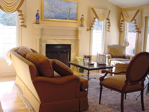
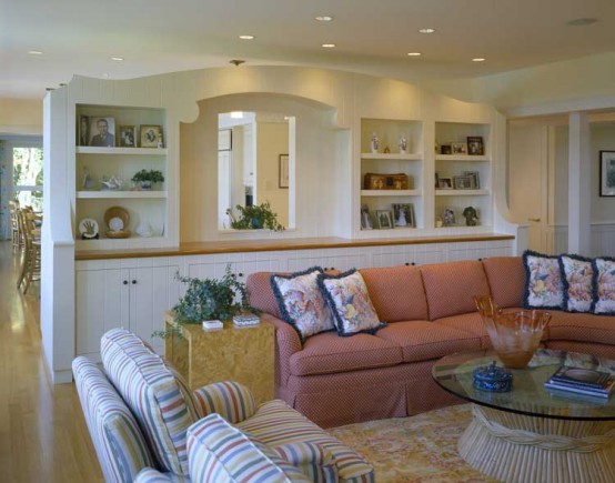
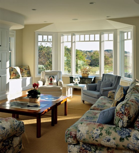
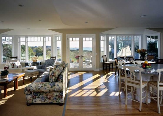
The Living room is one of the most important rooms while doing the interior design of your house. The living room interior reflects your taste and the interior designer’s capabilities at the first step. The choice of colors and accessories is one of the most important factors in designing your living room. You need to understand what are the primary and tertiary colors and the basic principle of mixing them to get better shades. The sofa and other furniture that you use and the material they are made of is also an important factor. Apart from that the flooring that you select be it marble, tiles or wood it should go with the entire room interior.

If you happen to hire the professional interior designer, you may be free to do the home decor yourself. But, you need to specify to the interior designer what you really want to achieve in your design. Make it clear about your choices of colors, the air that you want to feel when you’re in the particular room, or the furniture that you want to put in there.
All of these information really useful for your interior designer because she could get your point of view first before she gets to work. This will allow you to save both of your time so she don’t have to undo what she already made before just because you don’t like the color, or because you don’t want particular furniture being placed in the corner.
http://didemhomes.com/
 This crisp, clean formal room uses sumptuous fabrics to achieve its rich look. Design Tip: Subtle punches of color, such as the green silk drapes or the blue green silk chair fabric, add flair to light and airy rooms.
Blue brings down blood pressure and slows respiration and heart rate. That’s why it’s considered calming, relaxing, and serene, and is often recommended for bedrooms and bathrooms. Be careful, however: A pastel blue that looks pretty on the paint chip can come across as unpleasantly chilly when it’s on the walls and furnishings, especially in a room that receives little natural light. If you opt for a light blue as the primary color in a room, balance it with warm hues in the furnishings and fabrics.
This crisp, clean formal room uses sumptuous fabrics to achieve its rich look. Design Tip: Subtle punches of color, such as the green silk drapes or the blue green silk chair fabric, add flair to light and airy rooms.
Blue brings down blood pressure and slows respiration and heart rate. That’s why it’s considered calming, relaxing, and serene, and is often recommended for bedrooms and bathrooms. Be careful, however: A pastel blue that looks pretty on the paint chip can come across as unpleasantly chilly when it’s on the walls and furnishings, especially in a room that receives little natural light. If you opt for a light blue as the primary color in a room, balance it with warm hues in the furnishings and fabrics.
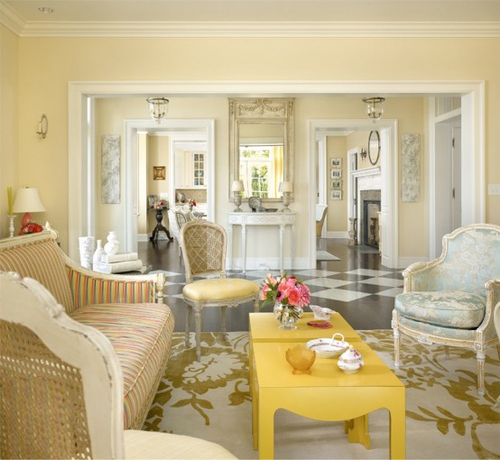
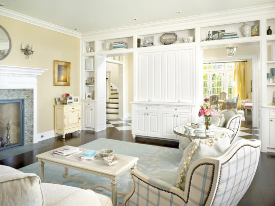
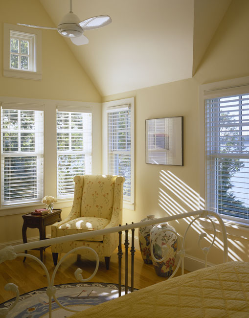
 Yellow captures the joy of sunshine and communicates happiness. It’s perfect for kitchens, dining rooms, and bathrooms, where happy color is energizing and uplifting. In halls, entries, and small spaces, yellow can feel expansive and welcoming. Yellow although is a cheery color is not a good choice in main color schemes of a room.

 Red raises a room’s energy level. It’s a good choice when you want to stir up excitement, particularly at night. In the living room or dining room, red draws people together and stimulates conversation. In an entryway, it creates a strong first impression. Red has been shown to raise blood pressure, speed respiration and heart rate. It is usually considered too stimulating for bedrooms, but if you’re only in the room after dark, you’ll be seeing it mostly by lamplight, when the color will appear muted, rich, and elegant.
Red, the most intense, pumps the adrenaline like no other hue.
Red raises a room’s energy level. It’s a good choice when you want to stir up excitement, particularly at night. In the living room or dining room, red draws people together and stimulates conversation. In an entryway, it creates a strong first impression. Red has been shown to raise blood pressure, speed respiration and heart rate. It is usually considered too stimulating for bedrooms, but if you’re only in the room after dark, you’ll be seeing it mostly by lamplight, when the color will appear muted, rich, and elegant.
Red, the most intense, pumps the adrenaline like no other hue.

The ceiling represents one-sixth of the space in a room, but too often it gets nothing more than a coat of white paint. In fact, for decades, white has been considered not only the safest but also the best choice for ceilings. As a general rule, ceilings that are lighter than the walls feel higher, while those that are darker feel lower. Lower” need not mean claustrophobic: Visually lowered ceilings can evoke cozy intimacy.
Dark walls make a room seem smaller, and light walls make a room seem larger.


 Combe house is an Elizabethan Manor nestled in beautiful countryside.
The Tommy Wax bedroom in Combe House:
each bedroom has been individually styled with antiques.
http://www.metro.co.uk/travel/801475-combe-house-is-a-scones-throw-from-beauty
Combe house is an Elizabethan Manor nestled in beautiful countryside.
The Tommy Wax bedroom in Combe House:
each bedroom has been individually styled with antiques.
http://www.metro.co.uk/travel/801475-combe-house-is-a-scones-throw-from-beauty